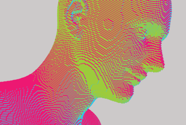
Modern information based economies, enabled by technologies like the Internet, have unleashed a sandstorm of information, also called Big Data.
Information is useful because it aids decision making, but there are many challenges. How to capture, store, analyse, search, share, and transfer vast amounts of data swirling at high speed? How can one picture the story that the data is telling, and interpret it in a way that adds business value? Would this be manageable if all the data were neatly organised? It might be manageable but still by no means straightforward. But no such luck! Big data comes in many forms: structured, unstructured, highly unstructured, and hails in a variety of data: text, images, audio, and video.
Tracking and analysing each grain of sand is impossible and may not even be useful. Instead, snapping some pictures of the overall sandstorm can provide many valuable insights. In other words, we can benefit from Data Visualization. Data Visualization requires creativity to make large data sets simple, appealing, and digestible for the end user, who can then make decisions by analysing the available data. Visualization helps tell a story about the data that the end user can quickly understand.
Some of the key points to be kept in mind during the data visualization process –
- Keep it simple (mostly): Visualisation often involves representing data in charts, but the type of chart you choose completely depends on the use case. Is it better to use a chart that supports the data or the one that helps the audience reveal key insights? You might say that both are important, and that’s exactly why complexity arises. Combining technical and business expertise is crucial: a data and visualization expert who is also a problem solver and a good communicator is what you really need. Simple charts are preferable since they are easily comprehendible. However, an expert in the field is key to understand which chart to use according to the data and the business context. For example, graphs can be as simple as a bar chart, or as complicated as a tree map or sunburst that are used to represent hierarchical and sequential data, respectively.
- Define the goal: Defining the intent of the visualization sets the path towards choosing the most appropriate graphs and charts to represent the data. For example, are you trying to explain, explore or exhibit the data? This provides a starting point for choosing the right visuals. Although knowledge of statistics surely helps when trying to derive useful insights from data, visualization can tell a story that makes it easier to identify and interpret those insights.
- Aesthetics are important: Do you have too many colours in your graphs? Are the sizes of data points slightly off? Are your graphs too monochromatic? Colours and shapes matter just as much as the data itself because they effect the user’s ability to analyse and understand the data quickly and easily.
- Ensure data accuracy: If the data isn’t prepared carefully, visuals might depict insights that are wrong. Taking a bird’s eye view of the data should be the starting point before adding filters to look at the data more deeply.
- Tell a story: Can you tell a story about the data after going through the data visualization process? If you can, then you know you have uncovered some useful insights. What is the story in your interpretation of results? Is there one at all? Story and visualization should go hand in hand.
Choosing the right tool for visualization is quite subjective since understanding the pros and cons of various tools and making the right choice depends on various factors such as the size of the organization, the kind of projects they are doing, and so on. Open source tools such as R and Python are very popular, while subscription based tools such as Tableau and Qliksense are powerful too.
Visualize, gain valuable insights, make sound decisions, and you are on the pathway to making sense of the sandstorm!